As their open dataset grew, Mapillary needed to understand how different users accessed and navigated geospatial data in order to consider potential solutions that balanced performance, legibility, and feasibility
When More Data Makes a Map Less Usable
Mapillary is an open-source street-level imagery platform that uses computer vision and structure-from-motion (SfM) to generate large-scale 2D and 3D geospatial data. As usage grew, so did the density of imagery—particularly in urban and high-traffic areas.
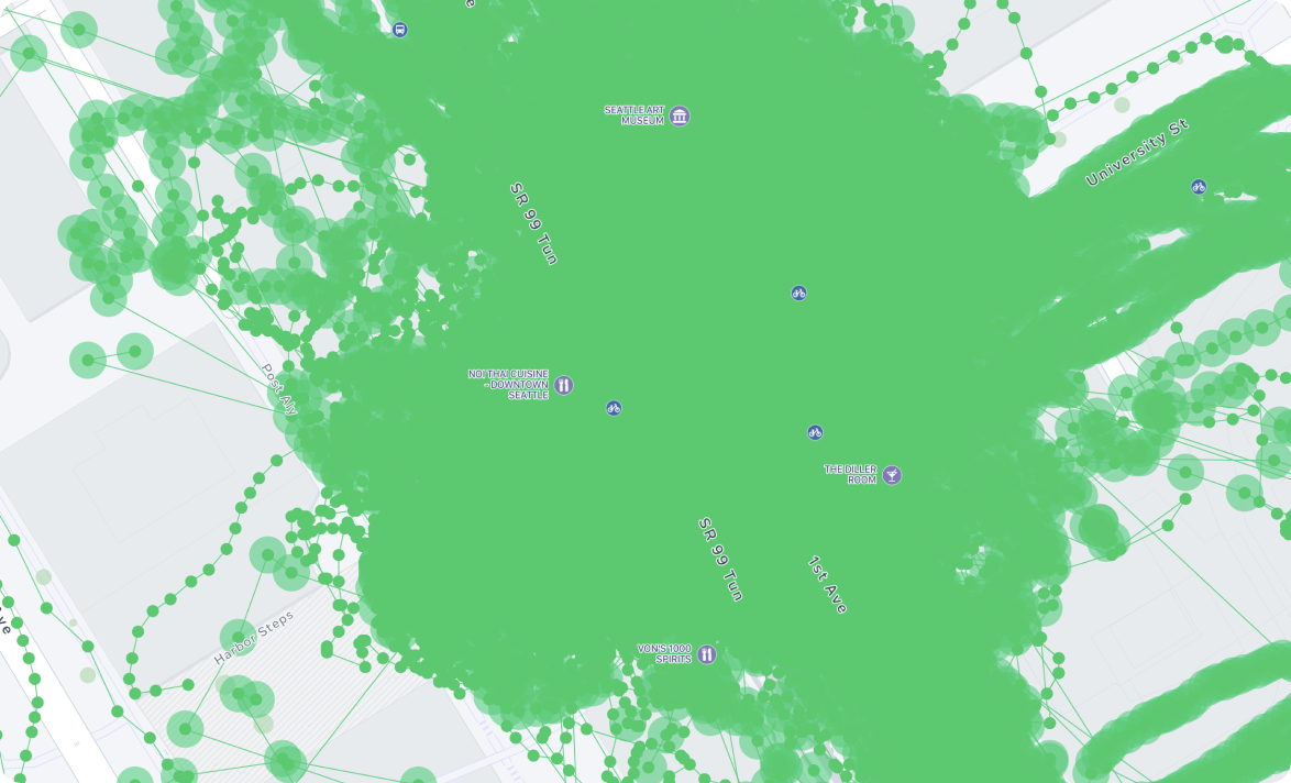
While the availability of data was Mapillary’s strength, it had begun to undermine usability. In many locations, the map became visually congested, slow to load, and difficult to navigate—making it harder, not easier, for users to access the information they needed.
I was asked to explore how we might improve the legibility and accessibility of this growing dataset across platforms, without compromising data integrity or the needs of different user groups.
- Excessive visual clutter obscured geographic context.
- Performance degraded in high-density areas.
- Users struggled to locate relevant imagery for specific tasks.
Making the Users Visible
At the outset, Mapillary lacked a shared understanding of who its users were and how they accessed the data. Before proposing solutions, I focused on grounding the problem in real user needs.
I conducted interviews across known user types to understand platforms, goals, and workflows. To complement this qualitative work, I built lightweight analytics tools on top of Mapillary’s public API to identify usage patterns we couldn’t reach directly.
By combining these inputs, I developed a set of core personas and mapped their primary workflows. This clarified that “too much data” was not a single problem, but manifested differently depending on user intent.
Exploring Solutions with Real Data
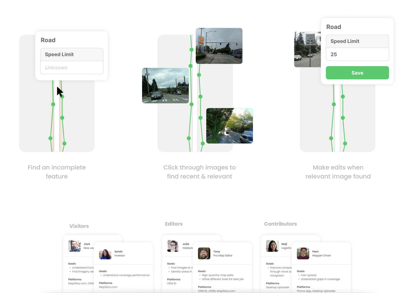
Rather than relying on abstract mockups, I prototyped directly with live Mapillary data using Mapillary JS and Mapbox JS. This allowed us to test concepts under real-world conditions and surface technical constraints early.
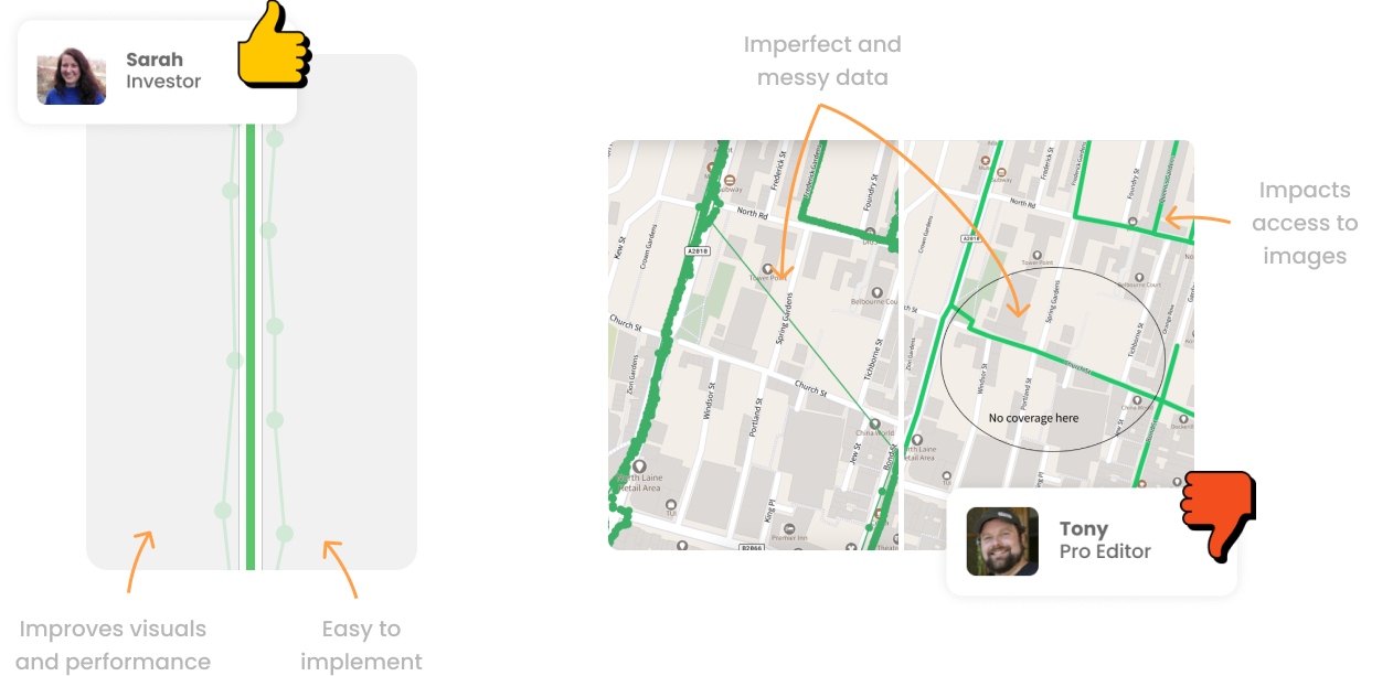
Through exploration, a key insight emerged: there was no single optimal solution. Improvements for one user group often degraded the experience for another. Some internally popular ideas—such as aggressively map-matching imagery to roads—risked hiding valuable data or misrepresenting its true location.
Varying User Needs
The personas became critical tools for communicating these trade-offs and preventing oversimplified fixes. However, they highlighted how one solution might seem ideal for one user, but detrimental for another.
Outcomes and Strategic Direction
Instead of converging on a single feature, the work resulted in a set of complementary solution directions, spanning near-term improvements and longer-term shifts in thinking.
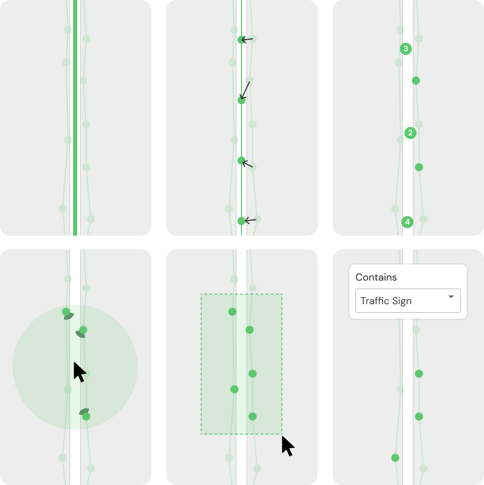
- Meta Sequences: A concept to aggregate imagery along mapped routes, improving visual clarity while preserving access to the underlying data.
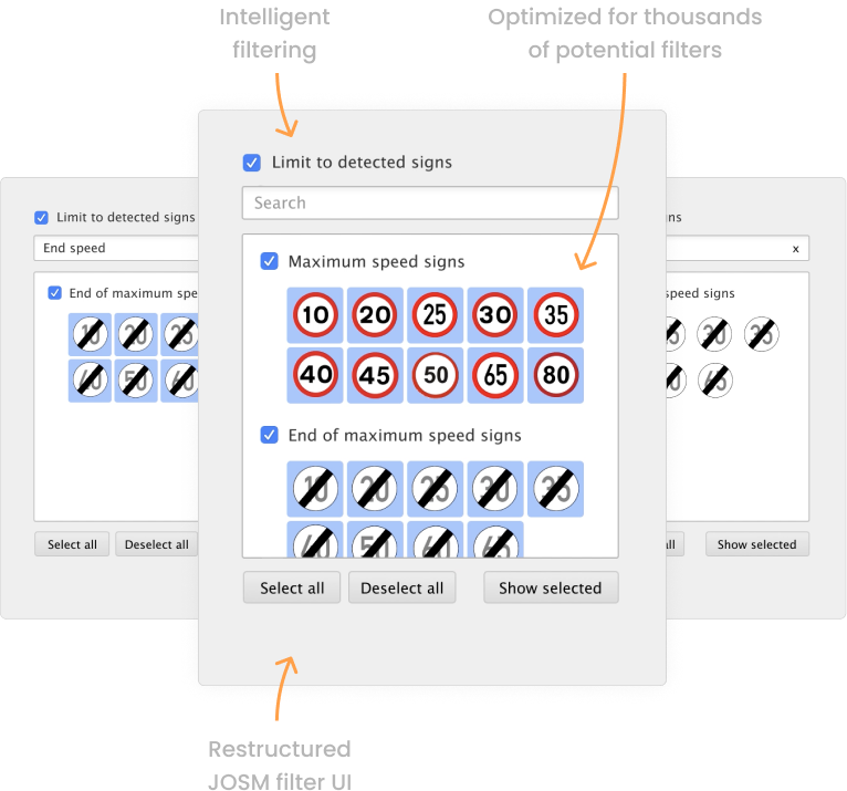
- Data Filtering: Near-term controls that allowed users to filter imagery by detected features, reducing on-screen clutter without automation.
- Workflow Automation: A broader insight that future products could automate entire user tasks rather than forcing manual data exploration.
While changing company priorities limited full implementation, this work reshaped how the team thought about users, data, and UX beyond the interface. It established a shared understanding of Mapillary’s audience and introduced automation as a strategic lens for future product decisions.